
Visualizing H1B Visas in Tech from 2012-2016
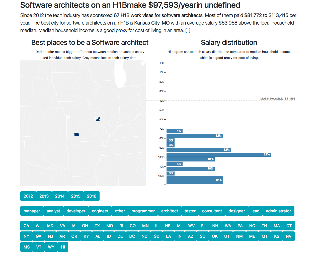
This data vizualization app was built while followig Swizec Teller’s excellent React+d3.js book, which I highly recommend to anyone interested in learning how to build cool visualizations via React and d3.js. The app displays a spatial distribution of areas in the USA which pay the highest for different tech jobs that are available for H1B visa holders. The data can be filtered based on years between 2012-2016, and can also be filtered via the different categories of jobs available as well as on a state level. The app also displays a histogram that categorises the distribution of tech salaries in a specific state or across the country compared to median household income, which is a good proxy for cost of living.
The app can be accessed at the following link