
Comparing Crime Rates Between Seattle and San Francisco
In this small post, we shall analyse the differences between crime statistics collected from Seattle and San Francisco. In short, we shall observe how the crimes vary across the months of a year in the two cities. We shall also map out the crimes recorded in the cities to identify the areas of the cities with a greater propensity for witnessing crime incidents.
Main Conclusions
The following are the main conclusions of this analysis:
The number of crimes committed in Seattle are way more than the ones committed in San Francisco over the duration of a year. Both the cities experience the peak of crimes in the months of June,July and August.
The incidents of crime are concentrated in the north-eastern region of San Francisco. The incidents of crime are concentrated in small urban pockets in Seattle,and the bulk of the crime occurs in the central region of the city.
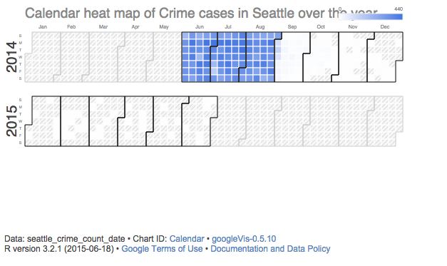
The yearly variations in the crime statistics in Seattle are as follows:
The yearly variations in the crime cases in San Francisco are as follows:
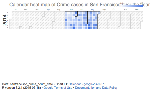
As it can be seen from the two charts above, both the cities witness the peak of crimes in the months of June, July and August. However,Seattle experiences a far greater number of crime cases as compared to San Francisco, and the city also experiences a much lower and decreasing number of cases from September till December. However, the data for San Francisco shows no such trend. A possible reason for the lack of data might be the fact that the dataset that we used did not contain complete information for San Francisco.
The following diagram illustrates the distribution of crime incidents across the areas of Seattle.
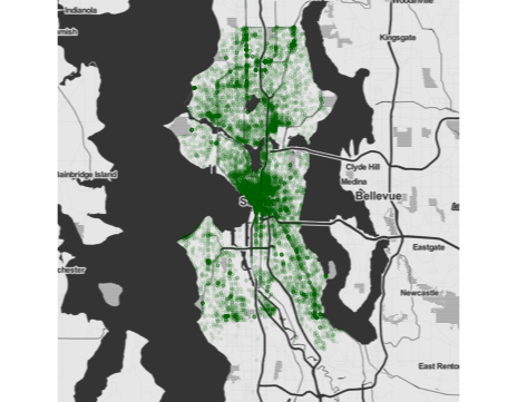
As can be seen from the above visualisation, the greatest number of crimes are reported from the central urban areas of Seattle. Apart from this, there is also a concentration of crime cases reported in small clusters, which are separated by regions of lower density of crime cases. This pattern supports the notion of the crime cases being more distributed in densely populated urban areas of Seattle.
The following illustration displays the crime cases reported across the city of San Francisco
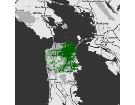
As can be seen from the visualisation, the greatest number of crime statistics are reported from the north-eastern region of San Francisco. Although there are pockets of areas with moderate levels of crime cases reported, the visualisation clearly shows that the north-eastern region of San Francisco is more prone to crime as compared to the other parts of the city.
Code For This Exercise:
The following is the code that I used to generate these graphs. The code was written in R.
require(googleVis)
require(ggmap)
sanfrancisco_dataset <- read.csv(“sanfrancisco.csv”)
seattle_dataset <- read.csv(“seattle.csv”)
seattle_dataset$Date.Reported <- as.Date(seattle_dataset$Date.Reported,”%Y/%m/%d”)
seattle_crime_count_date<-aggregate(seattle_dataset$Offense.Type,by=list(seattle_dataset$Date.Reported), FUN = length)
names(seattle_crime_count_date) <- c(“Date”,”Count”)
SeattleHeatMap <- gvisCalendar(seattle_crime_count_date,datevar = “Date”,numvar = “Count”,options=list(
 title=”Calendar heat map of Crime cases in Seattle over the year”,
 calendar=”{cellSize:10,yearLabel:{fontSize:20, color:’#444444'},focusedCellColor:{stroke:’red’}}”,width=590, height=320),chartid=”Calendar”)
plot(SeattleHeatMap)
sanfrancisco_dataset$Date <- as.Date(sanfrancisco_dataset$Date,”%Y/%m/%d”)
sanfrancisco_crime_count_date<-aggregate(sanfrancisco_dataset$IncidntNum, by = list(sanfrancisco_dataset$Date), FUN = length)
names(sanfrancisco_crime_count_date) <- c(“Date”, “Count”)
SanFranciscoHeatMap <- gvisCalendar(sanfrancisco_crime_count_date,datevar = “Date”,numvar = “Count”,options=list(
 title=”Calendar heat map of Crime cases in San Francisco over the year”,
 calendar=”{cellSize:10,yearLabel:{fontSize:20, color:’#444444'},focusedCellColor:{stroke:’red’}}”,width=590, height=320),chartid=”Calendar”)
plot(SanFranciscoHeatMap)
map.seattle_city <- qmap(“seattle”, zoom = 11, source=”stamen”, maptype=”toner”,darken = c(.3,”#BBBBBB”))
map.seattle_city + geom_point(data=seattle_dataset, aes(x=Longitude, y=Latitude), color=”dark green”, alpha=.03, size=1.1)
map.sanfrancisco_city <- qmap(“sanfrancisco”, zoom = 11, source=”stamen”, maptype=”toner”,darken = c(.3,”#BBBBBB”))
map.sanfrancisco_city + geom_point(data=sanfrancisco_dataset, aes(x=X, y=Y), color=”dark green”, alpha=.03, size=1.1)
(This blog post has been written as one of the assignments of the Data Science MOOC being offered on Coursera by the University of Washington). It was originally published on Medium
Leave a Comment